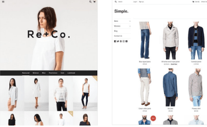
The Internet is a virtually unlimited source of information and advertising. Whether you are looking to buy, sell, research, or browse, the Internet has almost everything imaginable. With all of the different websites out there, what are some tactics to make yours stand out? There are a few tips to help your website stand out to the people you are trying to reach.
Keyword Placement
Because there are so many websites out there, most people use a search engine to find the websites they want. One of the exceptions is a function similar to Stumbleupon, where the program takes you to websites almost at random. Even this software tries to find sites that you will like based on your search and browsing history. Because most people place such a high reliance on keyword searches, keyword placement is the most important part of making a website.
If you want to attract viewers looking for recipes, then you have to look at what most people use to search for recipes. Most people use some variation of the word “recipe.” Therefore, you should use the word “recipe” in such a way that the search engine picks up on your website and puts it in the list. Keyword placement and usage is the first step in professional website design.
First Impressions
If an Internet searcher is not sure what they are looking for, they will often skim a website and decide if it has what they need. They are not likely to scroll down a long page in order to find what they need. The average Internet searcher is more likely to decide whether your website has what he wants based on a first impression. Your website must be accessible and detailed enough to allow the searcher to find what they want and have it be what they want. If they cannot find what they need quickly, then they may not come back to your website, even if it does have what they need.
Color Scheme
Even those who are not artists can appreciate a good color scheme. Certain colors can elicit certain moods from the viewer. For example, blue is a very calming color, while red and orange are excitable colors. Different colors also convey different things when combined. For example, blue and white can be very professional, while blue and teal can be hard to read and make the reader disinterested in your content.
Headers
Headers and headlines are great for drawing in viewers. For example, there is a story about a magazine whose headline read, “English Politician Caught Wearing Women’s Clothes.” It was only inside that the magazine revealed that the politician mentioned was Margaret Thatcher. But by then, the magazine was bought and the magazine made money off the headline. Having the right headers can help the reader quickly find the information they are looking for. Even if the information on your website is not what they want, the memory of a helpful website will keep viewers coming back in case you do have what they want.

This is Rohan, I’m a Digital marketing Expert, Full time Content Writer and founder of BoxerTechnology.com I can help people across the world through my articles. I am sharing the latest stories from companies like Apple, Samsung, Google, and Amazon.


Leave a Reply